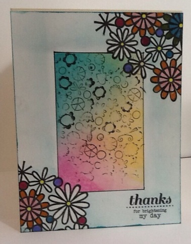
This is one of my riffs on creating the illusion of dimension and depth on a single layer card. The one above was a happy accident and was quite different from class instructions. (Sometimes things can go wrong in a good way!)
1. I masked the center rectangle and used to Distress Inks (Picked Raspberry, Fresh Lemonade and Peacock Feathers) Next, I rummaged through my stash and found a stamp of unknown origin. It didn’t stamp as clearly as I wanted, but I wanted to move on to the next step and didn’t bother to re-stamp it. As it happens the washed out effect seems to provide even more depth.
2. I removed the mask and then colorized the frame area with Peacock Feathers. I used larger-scale floral image (also unknown origin) to stamp the corners. Because the scale of this is so much larger it gives the illusion of a distinct fore and back ground. I colored the flowers with Distress Markers.
It’s not perfectly implemented, but conceptually, it works. My perfectionist streak balks at this, but this was a learning example. Perfection can occur when I am not already more than a week behind in class!
Now for my next illusion:
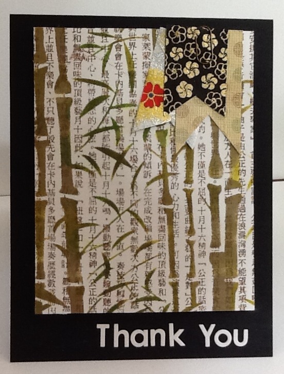
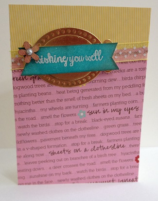
For this one, I once again played with a small scale background and then added a larger image over the top. In this case, the background is an old Hero Arts Asian text image with the Crafters Workshop Mini Bamboo Stencil. I inked the text in Studio Calico Doc Brown ink and then applied various distress inks to the stencil image. I had some beautiful origami papers that were begging to be used and these became the small flags in the upper right corner. I used some alpha stamps in white for the text.
Rules are made to be broken…the final piece is more than one layer!

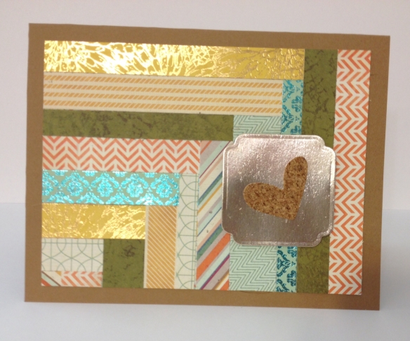
 Well, I made over 100 cards, 25 gift card carriers and more than a dozen gift bags. I believe I am done with Christmas now, but here is my last holiday card. It uses bits and pieces left over from the holiday creations. On to my next challenge, whatever shall it be?